

Charlotte Moss
1. Do your homework. Inform yourself on a daily basis.
2. Study magazines. Go to museums. Attend lectures.
Kelly Wearstler must-haves: a piece of art that means something to you
a piece of jewelry you'll keep forever
a terrific light fixture
Michelle Nussbaumer
1. A great rug be it contemporary or antique anchors any space.
2. More is more. Less is never more-less is obviously less? Who wants less.
Friday, October 30, 2009
Thursday, October 29, 2009
The Magazine That Changed My Decorating Taste Forever
The magazine that changed my decorating taste forever was the November 1997 issue of Traditional Home. To this day, it rocks my world! The photographer was Jon Jensen.
The home belonged to the Cunninghams in Nappa Valley. The murals painted throughout the home look like they came from an old villa in renaissance Italy but if the truth were known the work is of an Italian born and trained artist, named Carlo Marchiori, from nearby Calistoga. The fact that the Cunninghams had an ancanthus leafed glass topped library table much like my Ballard one helped.


This is my favorite picture in the home. It is at the end of the formal dining room where a smaller table is set up to be used as a plant stand for topiaries, as a serving table, or can be used as a breakfast table. I love the big baskets sitting under the table.

Look at the thickness of the marble slab that is the countertop.

Take in the fireplace in the breakfast room.

Get a load of the court yard below. And there is a lantern light fixture like the ones Joni Webb of COTE DE TEXAS admires and remember this was back in 1997.

The home belonged to the Cunninghams in Nappa Valley. The murals painted throughout the home look like they came from an old villa in renaissance Italy but if the truth were known the work is of an Italian born and trained artist, named Carlo Marchiori, from nearby Calistoga. The fact that the Cunninghams had an ancanthus leafed glass topped library table much like my Ballard one helped.

The pictures below allow you to see the painted walls and ceilings. You may also notice the glazed orange urns and the apricot velvet on the sofas.


The formal dining room has a painted mural covering one whole wall that has pocket doors that allow you to open it up into the kitchen or close the kitchen off for entertainment. On the side of the room you see below are French doors leading out into the court yard.

This is my favorite picture in the home. It is at the end of the formal dining room where a smaller table is set up to be used as a plant stand for topiaries, as a serving table, or can be used as a breakfast table. I love the big baskets sitting under the table.

Look at the thickness of the marble slab that is the countertop.

Take in the fireplace in the breakfast room.

Get a load of the court yard below. And there is a lantern light fixture like the ones Joni Webb of COTE DE TEXAS admires and remember this was back in 1997.

Tuesday, October 27, 2009
Decorating 102
Mark Phelps - Interior Decorator
1. Symmetry is important.
2. Mixing checks, leopard and needlepoint gives a room a feeling of having been decorated over time.
3. An ottoman can serve as a coffee table when a tray is placed on top of it.
Roger Banks-Pye - Artistic Designer
1. Always upscale not down.
2. If in doubt make it bigger.
3. Make a dark room darker.
4. Most modern sofas and beds are too low.
5. Old rugs are right in any house.
6. Changing patterns and colors in a small apartment makes for visual indigestion.
7. Never force your curtains into corrugated folds.
8. Proper height tables give authority and dignity to a room.
9. There are moments when white walls seem like a relief. Those moments should be discouraged.
William Diamond and Anthony Baratta - Master Colorists
Tips for the color challenged
1. Work with several colors at once. Stripes, tartans, tattersals and checks help you achieve an exuberant yet graphic unified look --and they are patterns that men, women, and kids can agree on.
2. Florals can unify a color palette beautifully. Knock out color combinations: red and green, black and white, red and turquoise, orange and teal, yellow and blue and brown and pink.
3. When mixing floral, stripe and a check, each should have one common color.
4. If you put floral on the front and sides of an armchair, put check on the back.
5. The more vivid the color, the more vivid personality your room will have.
6. Use white in a striped fabric or for upholstery piping.
7. Bright colors lose their punch next to beige or taupe.
8. Colors have cycles, just like fashion.
9. Gray is very sophisticated with many colors- black and white, red, pink, yellow and light blue- but don't ever do burgandy and gray.
10. In dark spaces, fair shades gives tthe illusion of light.
11. Black is a wonderful accent for a room; think of it as an accessory.
12. Floors look great painted shiny black.
Interior Decorating 101 By A Culmination Of Designers
Tips from author of Unmistakably French, and interior decorator, Betty Lou Phillips:
1. People can mix French furnishings with English, Italian and other elements when decorating.
2. Most French kitchens do not have cabinets with doors to conceal the clutter.
Designer, Henry Brown:
1. Mix modern and traditional styles against a neutral background.
2. Do not use matching China dinnerware, instead mix it up.
3. The best color palette includes putty, raffia, gray, sand, celadon, khaki and white.
4. The accent color can be a simple as charcoal or a Chinese red.
5. Put fine things with not necessarily fine things.
6. Put rough things with smooth things.
7. Put texture with gloss.
8. Put contemporary art with period furniture.
9. Put vintage pieces in a modern bookcase.
10. Use grand scale objects, like big candleholders, large architectural elements and oversize paintings.
Large things give a room a less predictable look.
11. Use vertical elements like hanging draperies from the ceiling and using floor to ceiling mirrors.
12. Use solid fabrics for upholstery.
13. Splurge on a small amount of silk or cut velvet for wonderful pillows.
14. Vary the style of little tables you place beside a sofa, bed or chair.
15. Put one Asian element in your room be it large or small.
16. Floor lamps give you light and free up table space.
Artist and interior designer, Lucinda Lester:
1. Bring outdoor accents in, like old shutters to lean up against a wall.
2. Use salvaged porch columns and old garden sculpture.
3. The French love large scale, lived in, not too perfect rooms. One large piece is better than a lot of
little pieces sometimes.
4. Add warmth to a room by using several textures and colors to create interest.
5. Add a touch of whimsy to a room by using a topiary or outdoor sculptural plants in urns.
6. Use stone, tile or wood floors in varying patterns throughout the home.
A Producer, former antique's dealer and weekend interior designer, Michelle Bedard:
1. Every room needs to have something a little off, and do not take things too seriously.
2. Prefers chips and scuffs on furniture to a flawless finish.
3. Put a contemporay white sofa next to an 1800's armoire.
4. Avoids any pattern but a stripe.
5. Make walls visually calm using cream, camel or chocolate walls and sea grass floor coverings.
6. Try hanging a trio of empty guilt frames.
7. Try placing a mirror outside the home's front door, exposed to the elements.
8. Place furniture in unexpected places, bring outdoor furniture indoors.
9. Vary the heights of pieces in a room.
10. Rooms should be more functional and personal not formal and perfect.
Monday, October 26, 2009
Examples of Kitchens That Hae Upper Shelving
The same magazine I referenced in the previous blog shows that upper closed kitchen cabinets can be lovely too.


Skirted Round Tables and Other Tables
Sometimes a magazine comes out that, is so good that it can only be termed just fabulous. In 2003, Better Homes and Gardens published just such a magazine from their Creative Collection Publications entitled, 100 decorating ideas Romantic Style. Virtually every picture in the magazine is worth putting on the blog, but I decided to first start out with the dining tables.
This table has me written all over it because you can see the scultural table even though it has a hint of lace covering it and it has a statue and urn on top of it,,,, everything I love.


Below, not skirted but beautiful, like maybe Tuscany?

The light fixture below is rustic. The room is eclectic.

Here is that no color room with cream ware.

This is like the dining room in the movie, "Something's Gotta Give" except for the red walls.

I could live with these chairs below, covered in dove gray!

Sunday, October 25, 2009
More On No Color Rooms
Still in the Traditional Home magazine October 2009 issue is another no color spread. This home is in the state of Washington where it rains constantly. So it stands to reason you might expect many homes to have walls painted a sunshiney yellow to brighten up the dreary, no sun days.
But not so with this home. The photographer is John Granen and Henry Brown owns the home and designed the interior. He selected a gray palette and was able to get away with that because the home has a southern exposure.


I like the pop of color given off by the two orange ceramic bowls. The frieze fragment over the mirror is stunning.


There are two custom tables adorned with orchids. You can easily see the open grid that divides the dining room and the living room.


Why can't this be my kitchen?

But not so with this home. The photographer is John Granen and Henry Brown owns the home and designed the interior. He selected a gray palette and was able to get away with that because the home has a southern exposure.

The grays are so easy on the eye. They are so soft and peaceful.

I like the pop of color given off by the two orange ceramic bowls. The frieze fragment over the mirror is stunning.


There are two custom tables adorned with orchids. You can easily see the open grid that divides the dining room and the living room.

I am going to find some cheap artificial artichokes, right now I only have one, and I am going to spray paint them white and purchase an apothecary jar to put them in for my kitchen or breakfast bar!

Why can't this be my kitchen?

Examples of How to Acheive the No Color Look
Traditional Home magazine, October 2009, featured among others, Eva Quateman's home. She indicated she wanted to have a no color home using ivory, white black and gold. She sees gold as I see red, at times, as a neutral more than a color. The photographer for this layout was Werner Straube.
In the living room, she designed the mirrored fireplace screen.


In the living room, she designed the mirrored fireplace screen.

The living room is eclectic but yet so traditional. One sees so few truly traditional looking homes any more that that it does my heart good to see this room.

The Chinese screens bring in that Asian touch. Every room should have something Asian in it no matter how small it might be. The fabric on the couch makes the room glamourus.

One recamier is found in the living room and another one is in the master bedroom.

If you look to the left you can see through the dining room into the library and one of the bookcases inside. The table base is Lucite.

She carried out the black and white look through out the breakfast room, kitchen and sitting room.

You can get a glimpse of the couch in the sitting room below in the right hand corner.
later.

Saturday, October 24, 2009
My First Christmas Posting
I realize it is still October but everywhere you go the retail stores are already putting out Christmas dispays. So I went way back to Traditional Homes 1997 Holiday issue to come up with some Christmas cheer. Because Christmas is timeless and never out of date. All it is, is steeped with individual family traditions.

First I am going to South Carolina. I wonder what and where that family is now? Gordon Beall was the photographer. This photo shoot was set in Charleston's historic district. In 1997, the neighbors were close and called upon one another during the holiday season and the children, girls that is, actually wore taffeta dresses! Many parties were held. White tulips played a large part in the Christmas decorations in this particular home.

The tree was nine feet tall and was decorated with red ribbon and white tulips placed in water vials.

I love the chairs covered in black with tiny white polks dots and the couch covered in black and white stripes. The fireplace is painted a flat, matted black and tulips abound from the tables and spill over the mantel.
The kichen abounds with Christmas goodies.

Fresh fruits, wreaths and topiaries fill the kitchen with more Christmas cheer.

Santa Fe, it is a great life!
Talk about colorful for the Fall season or any other time of year, Santa Fe has you covered. In the Veranda magazine March-April 2003 issue Peter Vitale took some sumptuous photos of artist, Ford Ruthling's home.

I love how your eye is drawn to all of the empty picture frames suspended from the tree.

And please let's not forget one of my favorite interior designers, Linda Applewhite, and her book, Architectural Interiors, because one of her homes is in Santa Fe and the other is in the San Francisco Bay area. Both homes are beautifully decorated. The home in San Francisco is decorated with a European Cottage slant. The photos are by Claudio Santini.

If you pick up on but just one thing in the following pictures, it should be Linda Applewhite's trademark for using "whimsy" in her approach to decorating. And next would be to remember one can achieve the crazy, colorful fabric decorated European Cottage/French Country look anywhere, even in the middle of a high rise in the city. Notice the background in the picture below.


Note the colorful art work and the rich color saturated walls throughout the home.


What can I say. Just go out and buy her book and go to her web site and sign up for her next seminar either in Santa Fe or San Francisco. You will have a ball.

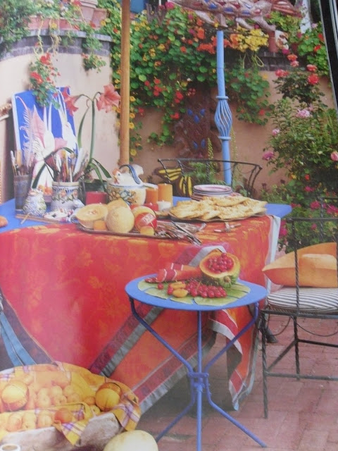
I would take a chance on a bee sting to eat here.

I love how your eye is drawn to all of the empty picture frames suspended from the tree.

And please let's not forget one of my favorite interior designers, Linda Applewhite, and her book, Architectural Interiors, because one of her homes is in Santa Fe and the other is in the San Francisco Bay area. Both homes are beautifully decorated. The home in San Francisco is decorated with a European Cottage slant. The photos are by Claudio Santini.

If you pick up on but just one thing in the following pictures, it should be Linda Applewhite's trademark for using "whimsy" in her approach to decorating. And next would be to remember one can achieve the crazy, colorful fabric decorated European Cottage/French Country look anywhere, even in the middle of a high rise in the city. Notice the background in the picture below.

The fabrics she puts together are off the map, great!

Look at the tassles hanging off the lamps, accompanied by a cubist painting and an antique sculpture.

Note the colorful art work and the rich color saturated walls throughout the home.


What can I say. Just go out and buy her book and go to her web site and sign up for her next seminar either in Santa Fe or San Francisco. You will have a ball.


Subscribe to:
Posts (Atom)
